
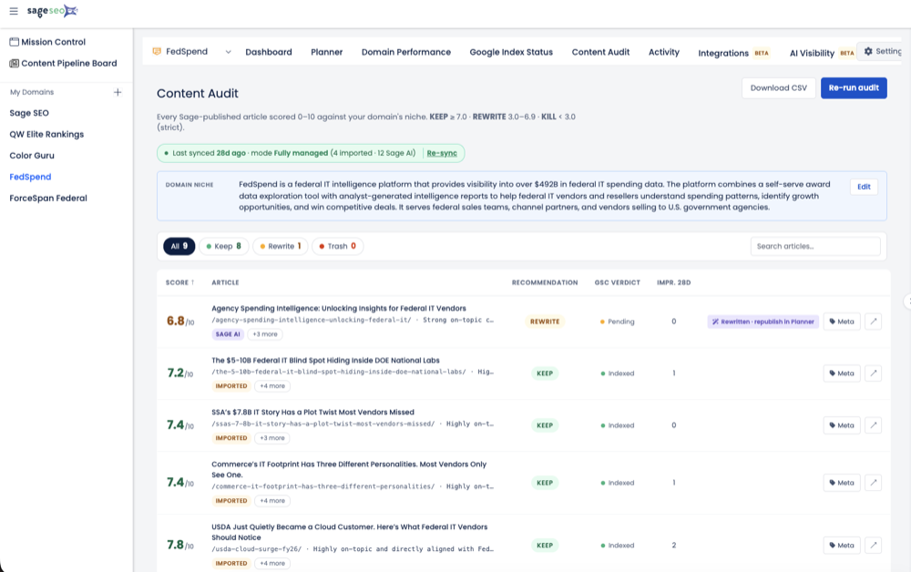

- GSC API exposes clicks, impressions, CTR, and average position.
- The API returns up to 25,000 rows vs. 1,000 in the UI.
- GSC retains roughly 16 months of historical performance data.
- High impressions with low CTR usually signals a weak title or meta.
- Sage re-prioritizes the action list as fresh GSC data arrives.
The most underused SEO asset I run into isn’t a neglected blog or a broken sitemap. It’s a Google Search Console property that’s been connected, verified, and quietly ignored for months. I once inherited a B2B SaaS account where GSC had been wired up for the better part of a year and the data had never once turned into a task. Everything worked. Nobody acted. That gap — between a connected Google Search Console data SEO tool and one that actually changes what you do next — is the whole story here.
The Search Console Connection Almost Nobody Actually Uses
Search Console is the most under-leveraged tool in SEO because it’s built for lookup, not for action.
Here’s a scar. A few years back I audited a SaaS client with roughly 340 published URLs. GSC had been connected for eight months. The dashboards loaded fine. Impressions were climbing. And in eight months, not a single recommendation, ticket, or rewrite had come out of that data. It sat there like a treadmill used as a coat rack.
That’s not a data problem. It’s a workflow problem. Having Search Console connected is not the same as having Search Console data doing anything.
The reframe I want you to sit with: most GSC dashboards answer “what happened.” Almost none answer “what should I fix first, and in what order.” You already own the demand signal — the same instinct behind building an SEO strategy on real performance data instead of vibes. The real question isn’t whether you have the data. It’s what pulls it, which fields matter, and what turns raw metrics into decisions.
What Fields Does the Search Console API Actually Pull?
The Search Console API pulls four metrics — clicks, impressions, CTR, and average position — sliced across dimensions like query, page, country, device, and date. That’s the raw ingredient list, and it’s worth knowing exactly what’s on the shelf before anyone tells you what they’ll cook.
Every serious integration runs on the Search Analytics endpoint. Google’s official Search Analytics API documentation defines the same core fields you see in the Performance report, just queryable programmatically. Here’s how the raw feed breaks down.
| Field | Type | What it tells you |
|---|---|---|
| Query | Dimension | The actual search term that surfaced your page |
| Page | Dimension | The specific URL that appeared in results |
| Country / Device | Dimension | Where and on what the impression happened |
| Date | Dimension | Day-level segmentation for trend detection |
| Impressions | Metric | How often you showed up |
| Clicks | Metric | How often someone actually came |
| CTR | Metric | Clicks divided by impressions |
| Average position | Metric | Mean ranking across those impressions |
The power move is combining them. A query dimension alone is noise; query plus page plus position over a date range is a diagnosis.
The Limits Honest Tools Admit To
GSC data isn’t infinite or instant, and any tool that pretends otherwise is selling. Three constraints matter in practice:
- Row caps. The Performance report UI tops out around 1,000 rows per view, while the API returns up to 25,000 rows per request — a big reason a real API-based integration beats screenshotting a dashboard.
- Freshness lag. Performance data typically runs a day or two behind, so today’s numbers aren’t fully baked yet.
- Retention. GSC holds roughly 16 months of history — enough for year-over-year, not enough to be your permanent warehouse.
None of that is a dealbreaker. It just means the feed is a sampled, slightly delayed snapshot — and your workflow has to respect that.
Why Raw GSC Metrics Alone Don’t Tell You What to Fix
Impressions and CTR in isolation tell you something is off but never what to do about it first. That’s the wall every team hits around month two.
Numbers only become useful in relationship to each other. I train teams to read patterns, not cells. A page pulling heavy impressions with a limp CTR is almost always a title-and-meta problem, not a content problem — the exact situation where rewriting the description to earn the click moves the needle faster than anything else. A query with impressions climbing but clicks flat usually signals a relevance gap: you’re showing up for something you don’t quite satisfy.
Read those as patterns to hunt for, not as sourced statistics. Here’s the mental model I hand people.
| What the data shows | Likely diagnosis | First move |
|---|---|---|
| High impressions, low CTR | Weak title/meta or poor SERP match | Rewrite the snippet |
| Rising impressions, flat clicks | Content-relevance gap | Reshape the page to the intent |
| Position 8–15, real impressions | Near-first-page opportunity | Targeted on-page optimization |
| Strong clicks, thin coverage | Under-built topic | Expand into a cluster |
Most teams stall right here. They see the numbers, sense something’s wrong, and then run out of hours triaging hundreds of query-and-page combinations by hand. The data’s fine. The manual triage is what breaks.
Skip the spreadsheets. Start Sage SEO free.
See how AI content ops transform your agency workflow in minutes.
How Does Sage Turn the Feed Into a Prioritized Action List?
Sage sits on top of the Search Console API and cross-references impressions, CTR, and position to flag specific pages worth acting on, then re-sorts that list as fresh data arrives. It doesn’t replace GSC. It operationalizes it.
Think of it as a logic layer, not a prettier chart. The raw feed comes in; the layer asks the questions a good analyst would ask if a good analyst had time to review every URL every week. That’s the honest version of “AI insights” — not magic, just a system running the same triage you’d run manually, at a cadence you can’t sustain by hand.
The Prioritization Logic, In Plain Terms
The most reliable opportunity signal in SEO is the “striking distance” band — pages ranking on the edge of page one with impressions to spare. It’s a widely published industry pattern, not a proprietary finding, and it’s the backbone of turning impressions to action. Here’s roughly how the sorting logic works:
- Ingest page- and query-level data from the API on a recurring pull.
- Flag pages in the position 8–15 zone carrying meaningful impressions as quick-win candidates.
- Separate those quick wins (high-impression, low-CTR, near-first-page) from slower content gaps that need net-new writing.
- Tie each recommendation to a specific URL and query, not a vague “improve your pages.”
- Refresh the ranking as new data lands, so the list stays current instead of freezing on the day it was built.
That last step is the one people miss. A static export is dead the moment you save it. A living list re-prioritizes itself — the near-page-one page you fixed drops off, and the next candidate rises. This is the same closed-loop thinking behind rescuing a single underperforming landing page in an afternoon, just applied across the whole property at once.
If you want to see that logic wired directly to your own feed, Sage’s GSC Momentum is the piece that reads the Search Console data and hands back a ranked to-do list instead of a wall of graphs. The feed stays Google’s. The prioritization is what gets added on top.
The Eight-Month Case: From Dormant Dashboard to Active Workflow
The turnaround wasn’t new data — it was wiring the existing feed into a process that surfaced work on a cadence.
Back to that SaaS client. The property was connected, verified, technically live. What was missing was any human process to review it. “Someone should check GSC” was on nobody’s calendar, so it happened never. The dashboard was a museum piece.
What changed was structural, not statistical. Once the feed fed an active workflow, recommendations started surfacing on a rhythm — each tied to a specific page and query — instead of waiting for someone to remember to log in. The team stopped hunting through 340 URLs and started clearing a short, ranked queue. The same shift I saw when we compressed a 12-page audit into a 20-minute task: the value wasn’t more information, it was less friction between signal and action.
I’m deliberately not going to hand you a percentage lift here, because I won’t invent one. The lesson is the process, not a fabricated number: connection is necessary and nowhere near sufficient. The value lives in the operational layer that turns “available” into “acted on.”
| Dimension | Dormant dashboard | Active workflow |
|---|---|---|
| Trigger to review | Someone has to remember | System surfaces on a cadence |
| Output | Charts you interpret | Ranked, page-specific tasks |
| Freshness | Whenever you last looked | Re-sorted as data updates |
| Failure mode | Quiet neglect | Cleared queue |
What to Check When You’re Evaluating a GSC-Connected SEO Tool
Judge any GSC-connected tool by what happens between data ingestion and human action — dashboards are a commodity now. Every tool shows you impressions and clicks. Almost none tell you what to do with them in what order.
When a prospect asks me how to vet an SEO data pipeline, I give them the same short list:
- Does it pull page-level and query-level data via the API, or is it just scraping the UI’s 1,000-row ceiling?
- Does it re-prioritize automatically as new data arrives, or hand you a one-time export?
- Does it produce a specific action tied to a URL, or another chart you have to interpret?
- Is it honest about GSC’s limits — sampling, latency, retention — or does it oversell precision it can’t have?
If a tool can’t clear those four, it’s a reporting layer wearing an automation costume. The differentiator in search console automation was never the data pull. Everyone pulls the same feed from the same Google.
Connected Is Not Active — And That’s Where the Money Leaks
I’ll stake a clear opinion on this: the connection step is table stakes, and the industry has spent too long congratulating itself for reaching table stakes. Wiring up Search Console is a fifteen-minute job. Turning that feed into a ranked, self-refreshing list of things to fix is the entire game — and it’s where most teams silently bleed value for months at a time.
If your GSC property has been “connected” for a while and you can’t name the last recommendation it produced, you don’t have a data problem. You have a dormant dashboard. Wire it to a workflow, and the same numbers you’ve been staring at start telling you exactly what to do next.